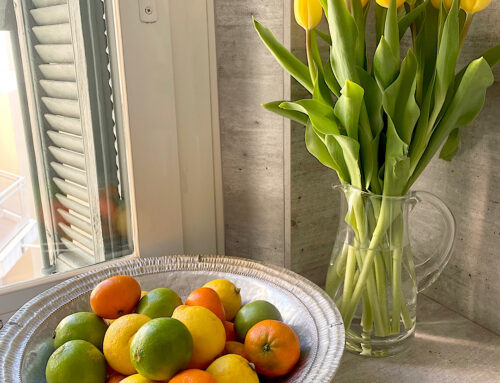

 Next month, Easter will appear in France with lovely chocolate shaped as chickens, rabbits and even bells, as ancient signs of fertility, a new life and beginning. I love a piece of dark chocolate and it is an ingredient and colour that symbolises warmth, comfort and luxury. In Feng Shui practice, the colour brown represents the Earth element and is the centre of your total living space. It is all about a sense of safety, reliability and grounding. Use the colour carefully as it settles and calms down energy, particularly water. If you are looking to activate a sector’s energy, other elements such as fire or water make more sense as they add growth and dynamism.
Brown or Beige?
 I remember an Australian fashion parade where the Compere said, oh, no, not brown! It does summon memories of the ugly painted shades of the 1970s with big yellow or orange flowers, not a fashion trend we would like to see return but who knows! These days there are various shades and textures. When using the colour brown, there are so many shades from pale cafe latte to deep chocolate and it can take the form of woods, terracotta, ceramics, stone and paint. Being a mix of red, black and yellow, one of these colours may be the dominant undertone. if you like a paint colour, buy a test pot and paint on a neutral piece of board or wood. Place in the area you are considering and look at it during the day and night to check how the shade looks in different lights. The tone may be too muddy, grey or bright. Don’t forget, wood or textures such as rattan can offer warmth to a room rather than paint. We have a lovely Chinese golden elm money chest that has travelled with us and we added a rattan chair to offer honey tones to the living room.
Colour Combinations
 Moving away from lime green, orange and pink, I prefer to see wood used but then brown paint is supposed to be the new grey. Dark chocolate can look chic against white, black and silver metal detail for a revival Art Deco look. Light caramel shades against scrubbed pale furniture offers a Scandinavian vibe while coffee tones with petrol blue offer a smart decor. I have seen brown with orange recently but the verdict is out. A little too retro for my tastes! Too much brown can look dull and tired. Remember to use the 60/30/10 rule – 60% is the dominate colour and usually the larger walls or furniture, 30% is the secondary colour and 10% is the accent. Then if you are brave, add a 4th colour as a secondary accent. For example, we have used white in the past as the dominate colour, beige and wood for the secondary colour and tropical green and bright navy within a plantation style. If in doubt, pull together swatches of colour on a board to see how they combine. Just don’t forget what Amanda Talbot said, “Our interiors are an insight into our brains. It is a collaboration of design, art, humor, irony, functionality, and the street.”