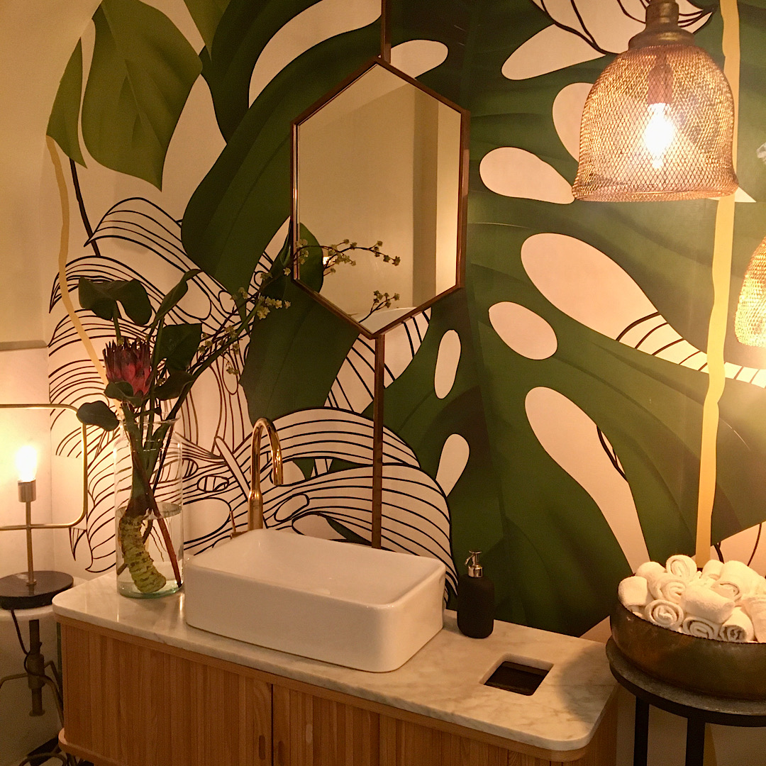
I love a spa for about thirty minutes and then I have had enough! Perhaps this is why I resonate with the Feng Shui practice of bathrooms not being visible, that don’t encourage you to spend time there. This is fortunate, as it is also the least favourite room in our apartment. The tiles are basic and although the room functions, it isn’t glamorous like previous bathrooms we have renovated. It was already installed when we bought the place and it looked like a laundry with a shower and toilet. We still wanted to add some kind of design, and retiling was not going to be even vaguely considered.
Feng Shui First
Other posts on the blog provide detailed information but the key point is that the bathroom is seen to be draining the energy and, in particular, abundance is seen to go down the drain. Some key Feng Shui tips include:
- Keep it spotless and tidy;
- Make sure drains work and are covered;
- If the pipes are old like ours, constantly use a mix of white vinegar and bicarbonate of soda to clean;
- Depending on what Bagua sector it is in, the general rule is to add stone and earth colours to ‘absorb the water energy’;
- Avoid water and sea decorations; and finally
- Keep the toilet seat down and the door closed.
How to Upgrade Without Renovating
 Not easy to do as the tiles and bathroom fixtures usually announce the style. Ideally, a lovely earthy tile with a smart pattern would have been great but we are stuck with basic tiles with no character. Step back and see what you can live with and what you can’t; what can be painted or changed without major work needed. The vanity unit was a fake wood laminate that was awful and drab. It was quickly painted a warm coffee colour and a smart rail was added for a hand towel. The shower head and unit was replaced for a small price and looks modern and smart. We tried with a corner plastic hold-all unit and it was a pain to keep clean. We have gone back to a classic wire version. There are stick-on tiles you can buy but that wouldn’t have worked in this room. We had to work with what was there.
Select a Style
 A Japanese style was chosen mainly because we have a Chinese A-frame that didn’t fit in any other room. Re-painted a soft green gloss, it is perfect for storage. A large ceramic bowl adds style and a colour combination of a retro green and a cafe latte tone was selected. Big laminated sliding doors had been used to hide the boiler, electrics and a washing machine. However, they didn’t shut properly and looked cheap. They were replaced by two Japanese-looking blinds which although not quite long enough, soften the effect and add to the style. French patterned soap and creme dispensers, luxurious towels in a big basket and a piece of art have been added for some colour and pattern.
What Next?
The mirror is basic and already chipped. It is possible to frame the mirror already there but there is also a light fitting involved. The search is on for a bathroom mirror with a frame. Always go as large as possible or as tall as possible to add the perception of height and space. Sometimes a room is as good as it is going to get and the only alternative is to start again if you have the budget and/or the inclination. As interior designer Albert Hadley stated, “a room should feel collected, not decorated.”


