
It is a long farewell between now and December as we leave Berlin and the breath of autumn at our backs adds a melancholy air. As we dismantled our Berlin apartment, sold off furniture and started to pack up loved pieces, it is hard to write about interior design and Feng Shui. The morning sun has a sepia tinge and there is a sudden desire for blue skies and brighter days. Interior design stores are full of natural earth tones and textures in response to our Covid cocooning and need for comfort. Even Zara Home’s store displays have a Vermeer accent of fruit and wood. How do we use these accents without looking dull and sad?
Browns & Beiges
 These colours offer a sense of calm but choose your shade carefully. Our past French apartment had a warm putty tone that brightens against the natural restored stone and white walls in the lounge but in the dining room, it looked grey and tired. We repainted that room in a warm ivory. I prefer to use beige as an accent colour against white and ivory and aim to find a yellow warm caramel under tone. Others love a rich brown which looks wonderful against white but be careful as certain tones can look dingy.
Feng Shui Tips
 Natural colours and fabrics partner with the Earth and Wood elements. Stone represents the earth and it is all about grounding the Chi energy which is interesting considering that I am seeing even biscuit earthenware in old classics such as Villeroy & Boch. It is as if we are paring back to basics – perhaps we will see a reactionary swing next year and future posts will be about luxury and red! Feng Shui advice talks about using Earth elements to ground too much Water – usually in the bathroom or in the Wealth sector. Wood is all about growth but can add too much energy. Think 1980s wooden country kitchens that were painted five years later. It is as if people instinctively felt, too much going on here!
Textures & Touches
Consider natural fabrics such as paper or wool, not just the usual linen. There are wonderful paper lamps these days that illuminate a room easily in a soft glow. For a Feng Shui cure of a major beam, we once draped an artist’s cut out of paper woodlands. It gave a New York apartment bedroom a bohemian feel. Others use fabrics and in France, we have used ivory linen curtains in the lounge and a soft cafe latte colour in the dining room. Other touches can be wool rugs, soft cushions and throws. Another Feng Shui note; try to keep away from synthetic fabrics, choosing cotton over nylon.
Boring Beige
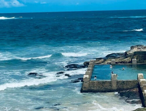
 Bring out the blue! If you read my posts, you know that I love this combination as it reminds me of my happy place of the sea, sand and stone. Beige can also give a 70s vibe with orange, lime green or lemon adding a sunny brightness we need in the winter months. For a chic Art Deco look, go for white, black and touches of caramel with classic silver accessories. It is all about creating a calm space but not a neutral place!