
 When I think of floral decor, immediately visions of dated Laura Ashley or 1960s yellow daisies come to mind. Hints of rural living and vases of roses, cakes and scones. Not my cup of tea! However; there is a modern take on floral patterns and if used carefully, you can avoid your space looking like grandma’s kitchen or a little girl’s bedroom. Floral patterns can add a sense of freshness and nature especially if the flowers are dramatic and set against dark, strong colour or lots of white or cream. And even the 1970s daisies have been reinvented. Of course, I would advise how to use flowers according to Feng Shui practice. Plants are symbols of earth’s natural life energy in Feng Shui and are about growth wherever you place them. They encourage an abundance of love and wealth and are recommended particularly in the relationship sector. Check out my previous posts including plants and how to use them in Feng Shui. https://interiorharmonyblog.com/2019/05/08/feng-shui-basics-plants/
No More Roses!
 There are alternative floral patterns to roses including lilies, orchids and other flowers that offer an alternative to the Victorian rose. If you still love a rich tone, this lovely Yves Delorme graphic pattern evokes a modern update on the 1970s faux Art Deco movement. Against the white negative space, rich greens and fuchsia add style and a chic focus for a bedroom. Use big patterns for a large room and let it make a statement with everything else as a backdrop. However, if you are brave, mix and match different floral patterns but use a core colour and tone and contrast large and small flowers.
 Our Berlin bedroom was in the relationship corner in Feng Shui and it was difficult to find something floral as we both prefer plain colours. We saw this pattern instantly and it reminded us of summer with the birds, tropical colours and the linen instantly uplifts the bedroom giving a sense of freshness, abundance and life. Other patterns can be strong tropical colours or the lovely fresh green and white patterns with leaves and trees. Fast forward to our current French apartment, we have our New York bed with a lighter colour and the same bed linen in our main bedroom.
Choose Your Colour
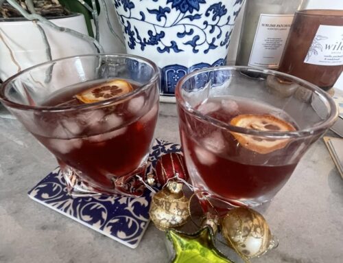
 Use the same method as if you are painting a room, 70% a dominant colour, 30% a secondary colour and 10% is a highlight. This photo shows the unusual combination of white, red and sky blue. Not a normal use of warm and cool tones. It is all about balance. 70% is the white negative space, enough red to pop and the plain blue wash adds a perfect update to porcelain for an English afternoon tea!