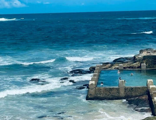

“She would be half a planet away, floating in a turquoise sea, dancing by moonlight to flamenco guitar.” Janet Fitch.
 Various artists have wonderful quotes on the blues, Yves Klein stated that, “Blue has no dimensions, it is beyond dimensions, whereas the other colours are not … All colours arouse specific associative ideas, psychologically material or tangible, while blue suggests at most the sea and sky, and they, after all, are in actual, visible nature what is most abstract.” Aqua, turquoise, petrol blue and any shades of blue in between, represent the sea and all things summer for me. It is a colour palette that is calming but bright, clear and yet offers depth. It matches with silver, grey, black, white, lemon and for the brave, citrus tones of orange and pink. Various civilisations across the centuries have revered the gem, turquoise, as a symbol of protection, spirituality and inner harmony. My favourite is the Apache legend that if you could find the end of a rainbow after a storm, searching the damp earth would yield a turquoise. Perhaps, that is why I am drawn to this colour.
Still Got the Blues
 If you follow my Feng Shui posts, you will know that this colour aligns with the Water element. The key areas to use it are the Inner Knowledge and Career sectors. It is all about the flow of energy, Chi. It can also be used in areas where Wood or Metal are the elements. Wood needs water to grow and Water polishes metal in the Feng Shui life cycle. It is best to avoid the Fire and Earth sectors including the Fame and Health areas. Water puts out fire and muddies earth. If used too much, it can create too much emotion and angst.
Let’s Talk About Bathrooms
 Just pause before you go and buy all things seaside and blue. If you follow Feng Shui, you are adding more of the Water element in an area already needing balance. Most Feng Shui practitioners recommend balancing the bathroom with Earth tones to balance the amount of water energy. If you don’t follow Feng Shui and love this colour, balance it out with white or sand tones and perhaps leave the starfish and seashells at the seashore!
Make a Statement!
 The Spanish influence shows a love of pairing aqua with strong colours including red, orange and green. If this makes your heart sing, the latest Smeg accessories or new tea sets will make you happy. Other ways to use this colour include doors, furniture, lampshades and bed linen. If this is too much, use touches with kitchen water jugs or tea towels. Use accessories including throws and cushions or even a teacup. As they say, go big or go home!
What Shade?
 My preference is for soft tones of blue and teal against a palette of sand and white. There is a gentleness and balance between the sand and the sea. However, in a French apartment we used it against a stark white wall which sang against the Cote d’Azur bright sun. It is all about balance. Think of the 60% dominant colour, 30% secondary and 10% minor or highlight tone. If you are brave, you could split 5% for one highlight and 5% for another. Our Berlin apartment has pastel teal against beige and white and the other 5% is a pale blue. In our previous French apartment we chose white, beige and hints of turquoise and lemon. A past small French apartment had a baby blue dresser in a retro kitchen dresser offering a hint of sky. The lounge had touches against the natural stone and wood. As stated before, we might not be able to control exterior events but if we can balance our inner harmony, it helps sail the seas.