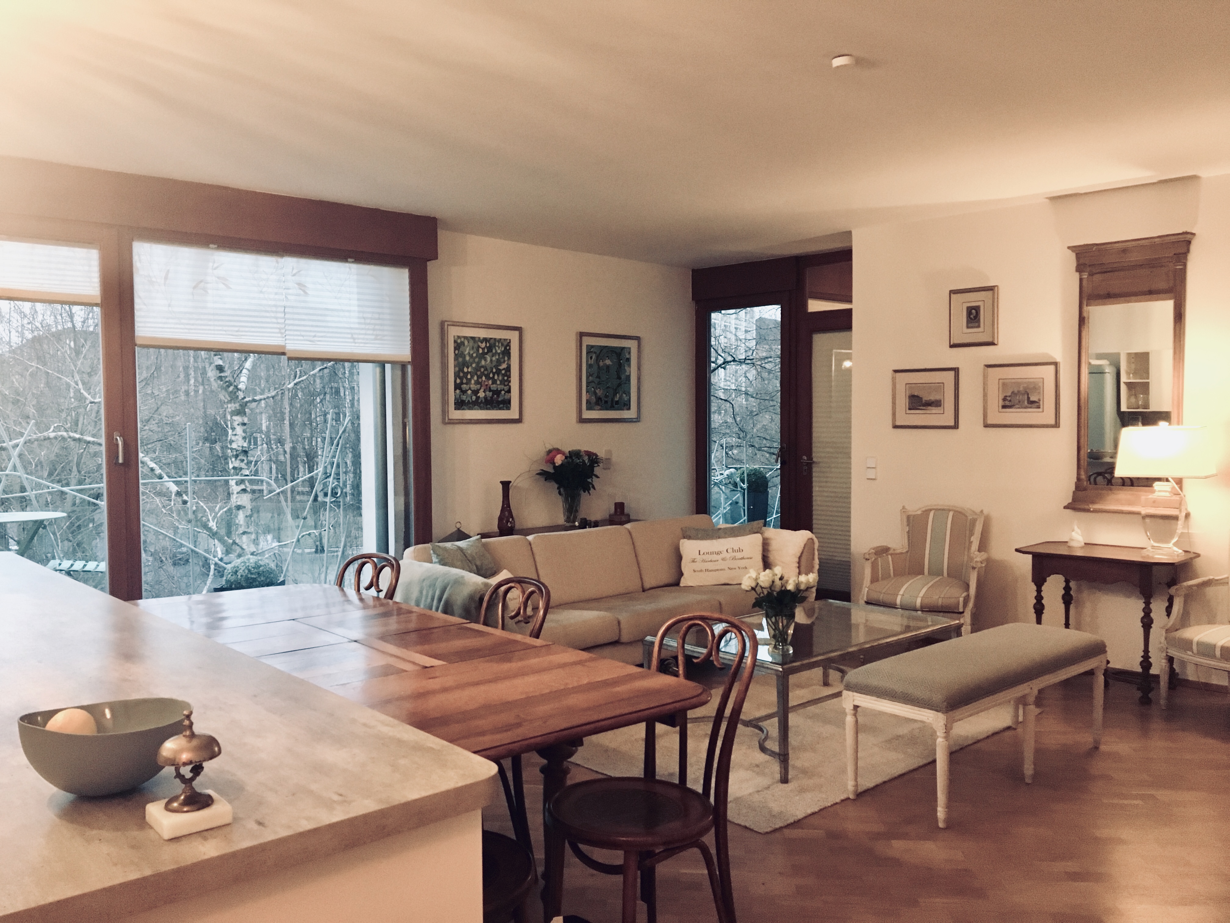
The lounge, the living room – whatever it is called, is the central meeting place of the house. It is an area to express your style. This lounge space has a lovely light and blends in to an open kitchen area. It is small but works with the way we live.
Colour First
 The Berlin lounge area was cluttered and tired looking – see this photo! We decided to completely renovate and strip the area of all clutter. We used the 60/30/10% ratios and chose the colours of 60% white with blue and cafe latte tones to offer a welcoming feel. We painted the curved wall sky blue for Feng Shui reasons and it mirrors the blue fridge in the kitchen. If still unsure, choose neutral colours and add brightness and style with cushions and inexpensive accessories.
We chose a modern eclectic style with French antique chairs and dining table mixed with a BoConcept sofa, modern TV cabinet and a Chinese money chest. Sounds awful but it works! Key tips for those following Feng Shui … make sure that when you are sitting on the sofa, ideally have your back to a wall and you should be able to view major entrance points. A challenge was the amount of window space and at the same time, this was the attraction as the morning sun shines through the trees offering a dappled light.
Furniture
 Take a look at what you have. Can it be painted, stripped back, stained or covered? If not, sometimes you have to let a piece go and either sell or donate. Somewhere in Berlin, there is a young, male engineering student who, out of desperation, took our medium sized French style, white coffee table and wardrobe! I whispered to him to paint them both. I don’t want to think of how many sofas I have bought due to lack of space, needing a sofa bed, an L-Shape or because the sofa couldn’t be sent through the window or up a staircase (France)! Boxy furniture looks great in a big space but if like us, the area is smaller, look to use furniture that is big but appears light with small legs and simple detail.
Mirrors
 A tall mirror was used to give the ceiling some height. When hanging mirrors, make sure you don’t ‘cut off your head’, go for waist level for a good height. Feng Shui tip: keep mirrors to a minimum; they are useful to reflect positive outlooks but can also double negative outlooks. Check out Clear Englebert for information on mirrors.
Curtains or Blinds?
 If you are lucky and have high ceilings, even a small space can look larger with full length blinds to draw the eye upwards. Rather than curtains, we chose plissé blinds. A patterned one was chosen at a weak moment but it actually gave a lovely Japanese effect with the sun shining through mirroring the surrounding trees and birds.
Floors
There are great ceramic tiles that look like wood, inexpensive floorboards and all can be softened with a rug. Not being a fan of carpets having two cats, I prefer rugs that are made of natural fibres that can be cleaned. Choose the rug size carefully and ensure a good space between walls. We probably chose a rug that was too small but had lost some motivation at that stage! Don’t forget that a rug can also give the perception of different zone spaces as when used in a studio.
Lighting
 Experts say to use three lots of lighting – ambient, task and accent. The area has a lot of light so we chose accent lights for the lounge as the kitchen has bright task area lights. A great gadget was found at the local hardware where you can have up to three lights that you can turn on and off with a remote. A lamp we had is a focal point and one friend hints that she might steal it!
Art Work and Accessories
 We had pieces from our travels and wondered how to pull them together. We chose the same brushed silver frame with different undertones depending on the art. There are plenty of sites that tell you how to hang pictures. I love to mix and match and to tell a story.
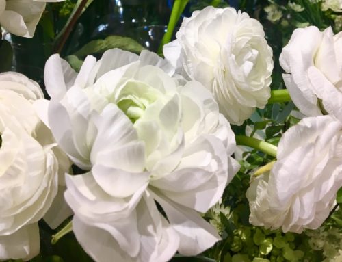
Buying cushions is up there with sofas! That being said, they add colour and effect in a minute and along with flowers, fairy lights or candles, offer even the most basic space – style and atmosphere.


