When we moved to Berlin we bought a lovely renovated apartment in a classic old German mansion near stunning lakes. It was beautiful, spacious but lonely. I had worked from home the last couple of years and that was a whole new experience – if you don’t have an office to go to, you need to be outside with noise, people, activity and life. After over two years, we decided to move to a more active area.
 We assumed that we would end up in a similar apartment with high ceilings and classical features within a German style apartment Hof. I realise now, when we plan a goal, more often than not, we end up at the opposite end of the spectrum wether it is houses or countries! We were lucky to find an avant garde apartment which was the opposite in every way. It was 15 years old, tired and needing some TLC.
Hinrich Baller – Curves, Art Deco and Whimsy
 The whole building was designed by Baller whose influence is a combination of Art Deco and Jugendstil movement with no straight walls and an unusual combination of naturalism and expressionist design. Mind you, he could have done with thinking of some practicalities such as drainage around the balconies but we won’t talk about pragmatism versus creativity! Even the bathroom floor and walls are not straight, so lots of challenges.
Challenges
 It was a smaller apartment with a different style and was in need of upgrading – yes, you would think I would avoid that word – renovation, but I can’t help myself. It had three balconies with two small ones and the beauty but challenge of lots of windows including one bedroom glass door. Some issues with water drainage including a tropical interior garden in the main foyer in a Northern climate that doesn’t make sense – creativity doesn’t alway match with practicality. There were few straight walls, lower ceilings and no artistic features.It had a strange kitchen and no idea why ice pink and navy were considered an attractive combination, even 15 years ago. Most of the apartments had this strange colour palette and configuration with the strong curved cupboard wall which would prove to be a challenge.
 The bathroom was completely lacking in design and had the toilet separated. There were ugly water taps in both the entrance and in the toilet room. It was pokey with no proper lighting and no windows and the classic European shower above a bath. Both bedrooms were tiny and had strange panels of windows with the main bedroom having a glass door.
So Why Did We Buy It?
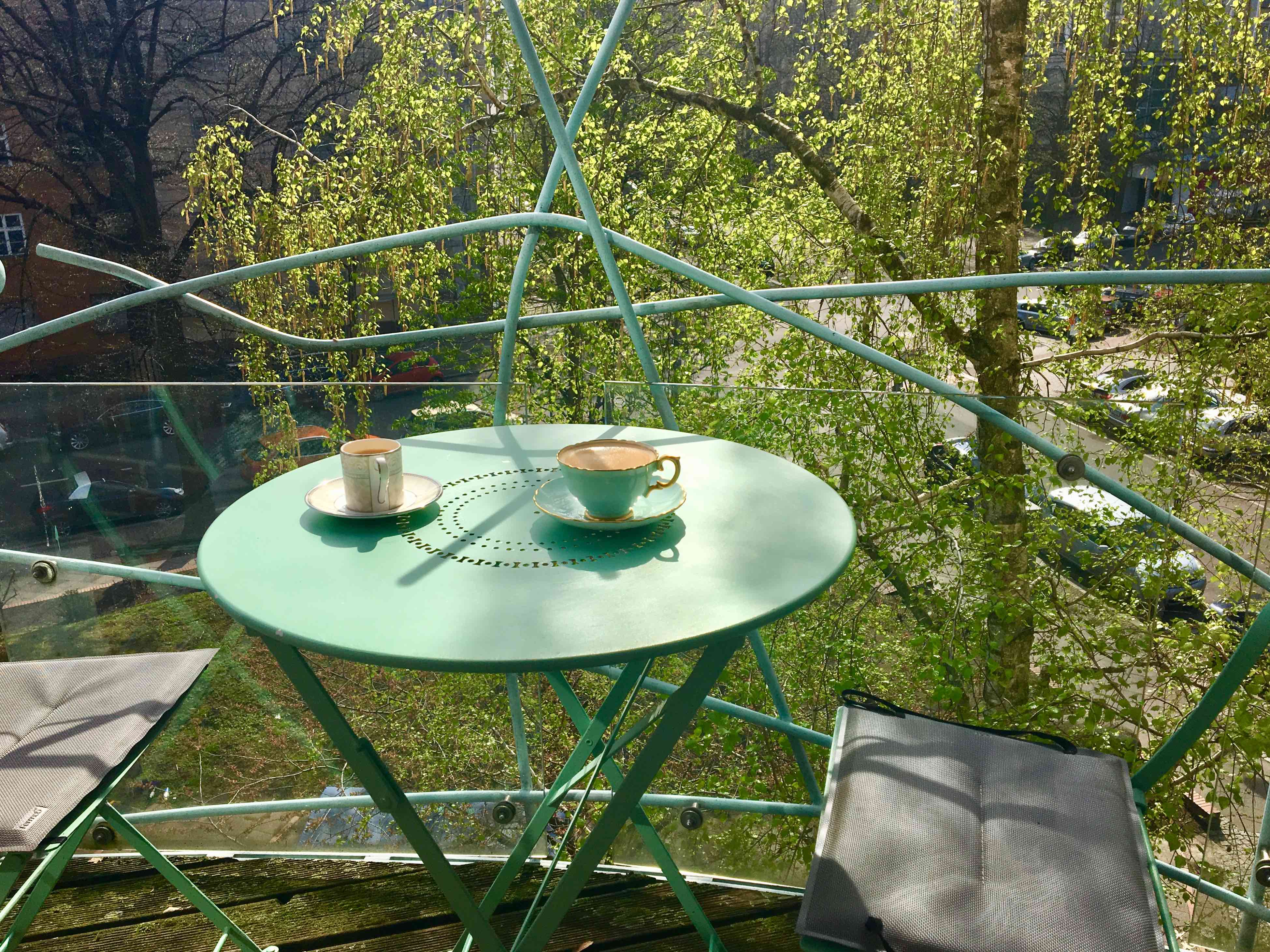
 We walked in and immediately felt a lovely soft energy. The light was flooding in and it was like being in a treehouse with birds singing and the sun setting. It is nature within an urban environment. We got used to watching out for a duck we name Jeremy (Jemima originally until we realised it is a drake!) and various squirrels who demand hazelnuts at the window. We were near shops, restaurants, cafes, transport and most importantly, life.


