
Here we are are, the first post of our tiny Southern France apartment! Having found the space and place, top of the list was to check out the Feng Shui. Having used the Bagua map and consulted with my mentor, Clear Englebert, we selected colours for each area and also for any challenges.
Rules for Colour Selection
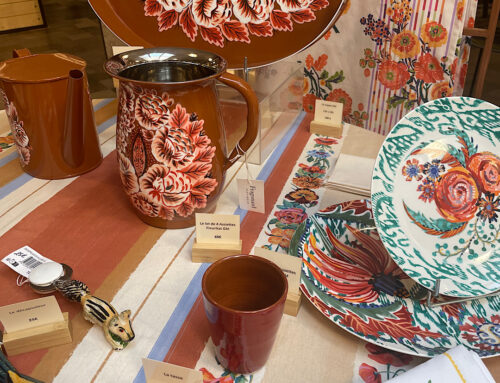
 Designers often say, choose 3 colours that harmonise and if you are brave, add a fourth tonal one. There is a 60/30/10% method. 60% is the dominant colour which can include walls or floor space or a dominate piece of furniture – for us it is the white walls and restored old stone. It provides a canvas for the rest. 30% is the balance colour and should be used half as much as the dominant colour. This second colour can be pulled in with curtains, accent furniture, bed linen and paintings. We chose apple green for thekitchen and lemon for the other side of the living areas.
10% is the accent colour and often adds drama or a wow factor. We chose lemon. Use cushions, ornaments, throws, candles and flowers. Then if brave, you can add a drop of a fourth colour as we have with aqua. This should be literally a touch, for example, you could use black, red and white and then a touch of grey, or use green, red and purple with a touch of turquoise as can be seen in peacock colours.
Shades of Grey
Using one colour with varying shades can be another option. The is most effective with shades of brown or grey. As will be seen in a future post, we used this in the bedroom with soft greys against white.
Which Paint?
 I am a fan of Farrow & Ball and Little Greene, and while not cheap, they have amazing colour palettes with high quality paint that is as smooth as velvet to use.
http://eu.farrow-ball.com
https://www.littlegreene.de
Walk Right In
While continuing to learn about Feng Shui practices, I have found that the colour selections now come more naturally. Having walked in through the front door, tune in to what the light and energy is saying. This has led to selecting colours I don’t normally resonate with but make sense for the style, space and dynamic.
Apples & Lemons
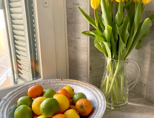
The natural blue sky and Cote d’Azur sunlight offers the chance to use strong colour as can be seen in the local Provencal reds, blues, greens and pinks. Immediately, it made sense to use apple green and lemon  tones to complement the stark white and renovated stone and to align with Feng Shui principles.
The small kitchen was a white strip of cupboards, offering a blank canvas to work with. Elements of wood and apple green accessories were added. Then dove grey, silver and white for the bedroom was used as it was in the Travel and Helpful people sector. The bathroom had been renovated in small chocolate and cream tiles which needed balancing with black and white for the career sector.
Colour for Challenges
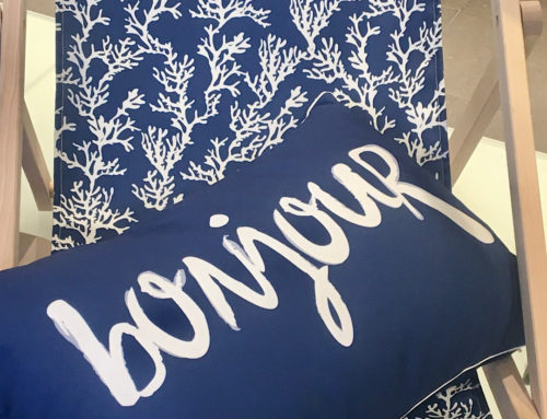
There were three alcoves that needed balancing according to Feng Shui. Aqua was chosen for the living area alcove for the water element and to tone in with the lemon and green. Dove grey for the alcove opposite the bathroom for metal and pale pink for the bedroom alcove – knowing that a soft white line curtain would cover this.
What If You Live in a Studio?
 Many people in cities are living in smaller spaces with the studio or one-room rental being popular. If you can create zones for each area, possibly sectioning off with furniture or a screen, use different fabrics, rugs, accessories in the different areas. If this isn’t possible, see if you can paint one neutral colour such as a shade of white, ivory, caffe latte as the 60% colour and add two other colours through sofas, blinds or curtains and accessories. A New York friend got permission to paint the studio a soft ivory colour. He used petrol blue and yellow in a sofa and accent chair and a drop down bed in ivory with complimentary bed linen with great effect. Adding yellow towels in the bathroom and wood in the kitchen pulled the studio together for a funky and fun living space.